Client
Amstelwood
Service
UX Architecture
Designing a digital experience for sustainable living
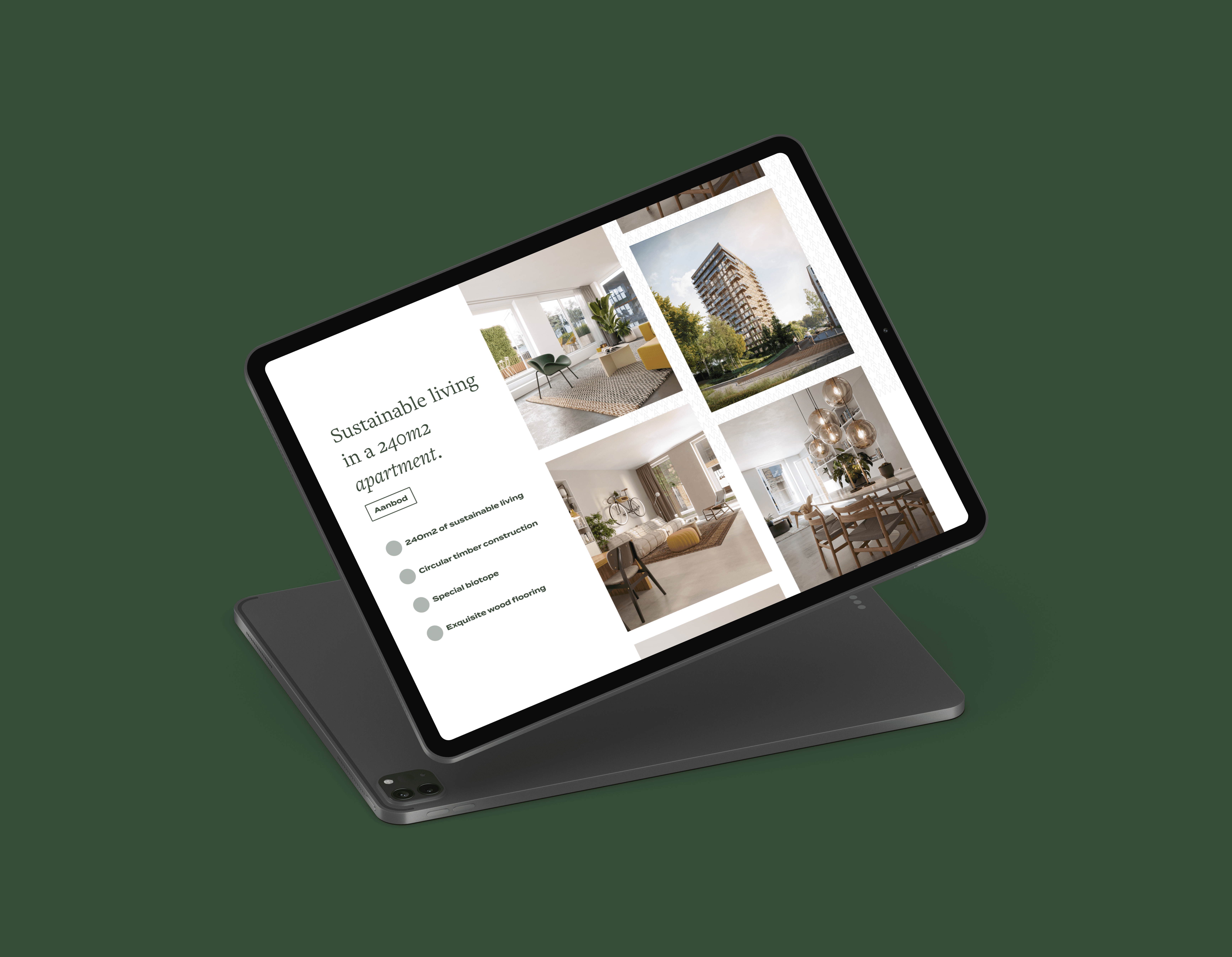
Amstelwood is a residential development focused on sustainable living, circular construction and a strong connection with nature. The website plays a key role in communicating this vision, highlighting both the architectural concept and the lifestyle surrounding the project. During my internship, I worked on the UX/UI design of the Amstelwood website, translating complex information about sustainability, housing and location into a clear and visually calm digital experience. The goal was to inform potential residents while maintaining a premium and nature-driven brand identity.
Design process
- UX research & content analysis - Information architecture - UI design & feedback iterations - WordPress implementation


Because the brand foundations were already established, my role focused on translating the existing brand system into a cohesive and functional digital experience. Rather than redefining the identity, I ensured consistent application across layout, hierarchy, spacing and interaction patterns, maintaining the calm and premium character of the project while optimising usability.
Amstelwood had defined a detailed sitemap upfront, which provided a clear structural starting point. Building on this foundation, I refined the information architecture and organised content into intuitive page structures. The goal was to balance clarity, discoverability and storytelling, ensuring users could navigate complex information effortlessly.
Unlike other projects, the client chose to move directly into visual design without a separate wireframing phase. This required making early structural decisions within high-fidelity layouts and validating them through frequent feedback sessions. The iterative collaboration ensured alignment while maintaining design quality and efficiency.
A key feature of the platform was an interactive map highlighting points of interest around the location. I designed and refined this component through multiple iterations, focusing on visual clarity, usability and seamless integration within the overall experience. The evolution of this section demonstrates how structured feedback can significantly improve both function and aesthetics.
Beyond the homepage, I designed several core pages including the offering page, about page and a live feed section. After launch, the client requested a full platform translation. This introduced an additional technical layer, requiring me to work within the WordPress environment and manage multilingual content while preserving visual and structural consistency.
The final result is a calm, cohesive and production-ready website that translates an established brand into a clear, structured and user-centered digital experience.


