Client
Coterie
Service
UX & UI Design
Redesigning the e-commerce and subscription experience for first time parents
Coterie is a premium baby care brand offering sustainable diapers through a subscription-based e-commerce model. The brief called for a full redesign focused on simplifying complex decision-making and optimising the conversion funnel, including the introduction of a new subscription model.


Role & Scope
As a UX/UI Designer, I was responsible for improving key parts of the e-commerce funnel, with a focus on reducing friction and supporting conversion.
My work included:
Conducting UX research, including flow analysis, usability testing and benchmark analysis to identify friction points
Analysing existing user flows and identifying friction across the funnel
Structuring and optimising information architecture for product selection and subscription setup
Designing end-to-end user flows, from onboarding to checkout
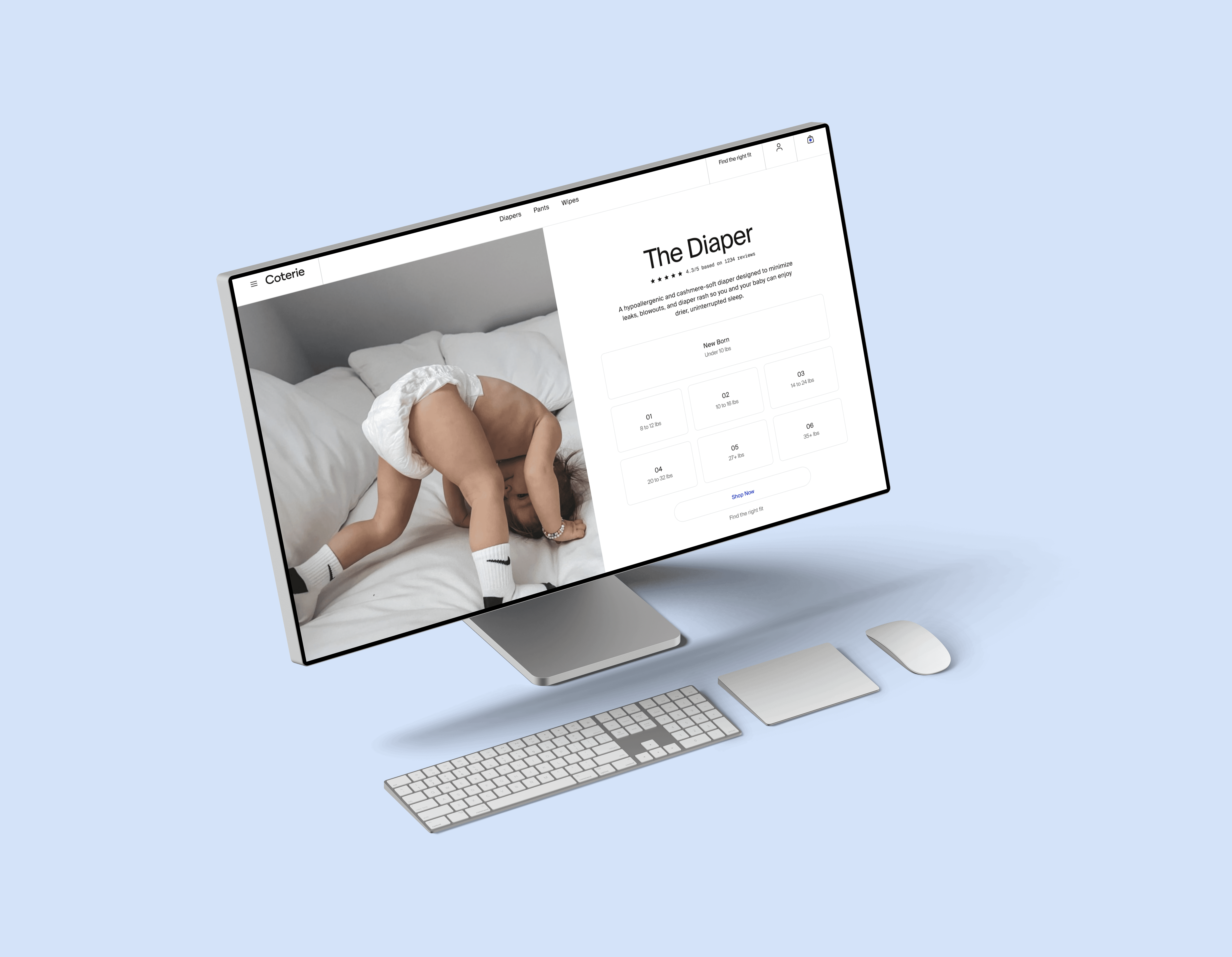
Creating wireframes for key pages, including product page, subscription configuration and cart
Translating UX decisions into high-fidelity UI designs aligned with the brand
Iterating on designs based on feedback from the team and stakeholders
Ensuring consistency and scalability through reusable components and design patterns
Challenge
Coterie serves first-time parents, a group prone to hesitation at purchase moments. This made clarity, trust and reassurance critical throughout the experience.
A key challenge was the complexity of the subscription model. Users had to make multiple decisions around sizing, product type and delivery frequency. When presented simultaneously, this increased cognitive load and hesitation, especially at key conversion moments.
Approach
Through UX research, flow mapping and usability testing, I identified friction points where users struggled to make decisions.
I redesigned the core user flows with a focus on progressive disclosure, clear information hierarchy and reducing cognitive load at key moments. This allowed users to move through the flow step-by-step, rather than being overwhelmed by multiple decisions at once.
Outcome
The result is a more intuitive onboarding and subscription journey that improves clarity and reduces friction at key decision points.
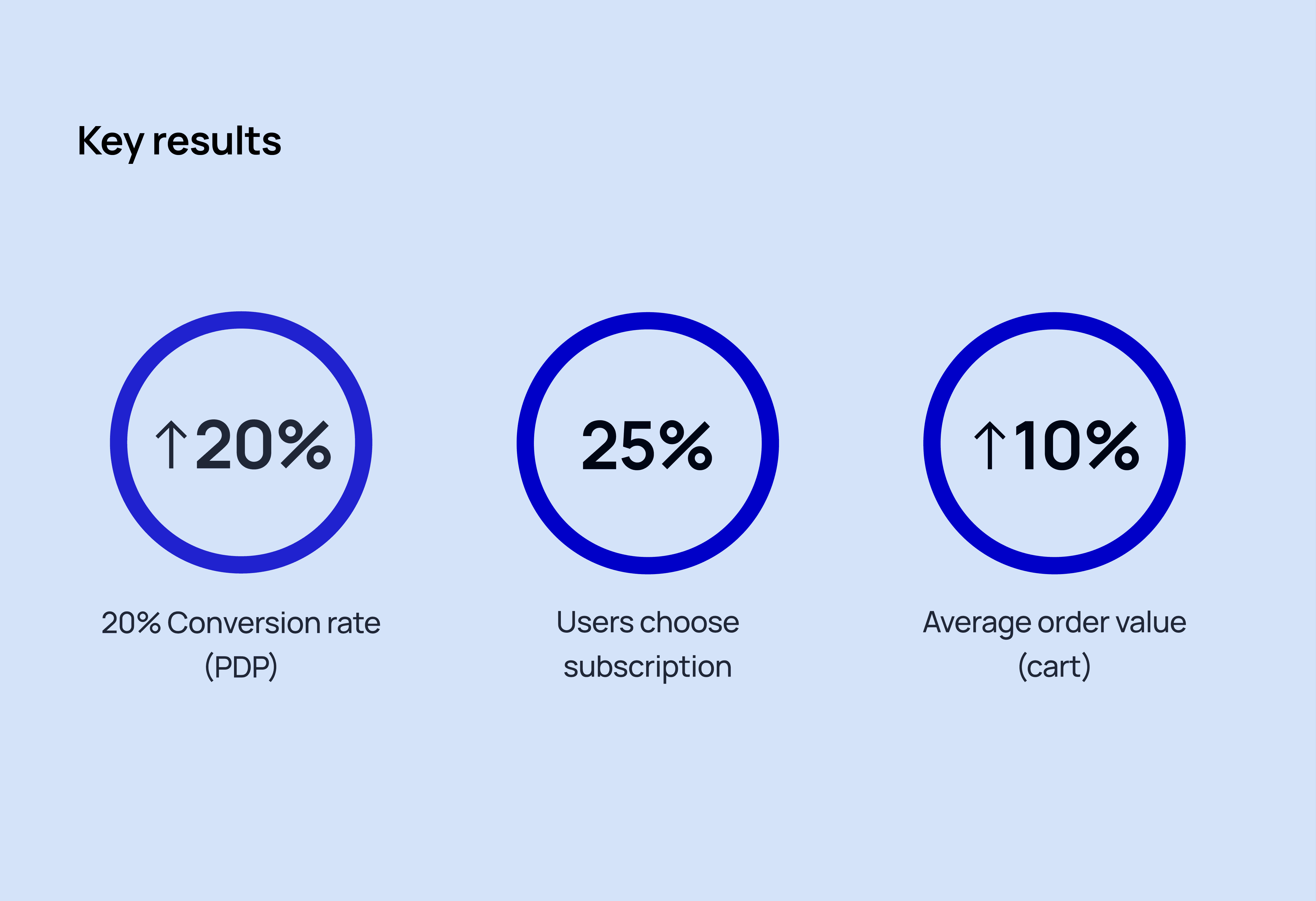
Based on usability testing and benchmark analysis, the redesigned flows show strong potential for:
~20% increase in conversion rate (product page)
High adoption of the new subscription model
~10% increase in average order value through improved upsell moments


