Client
Monytri
Service
UX,UI & Branding
Designing a financial platform that makes stock gifting accessible
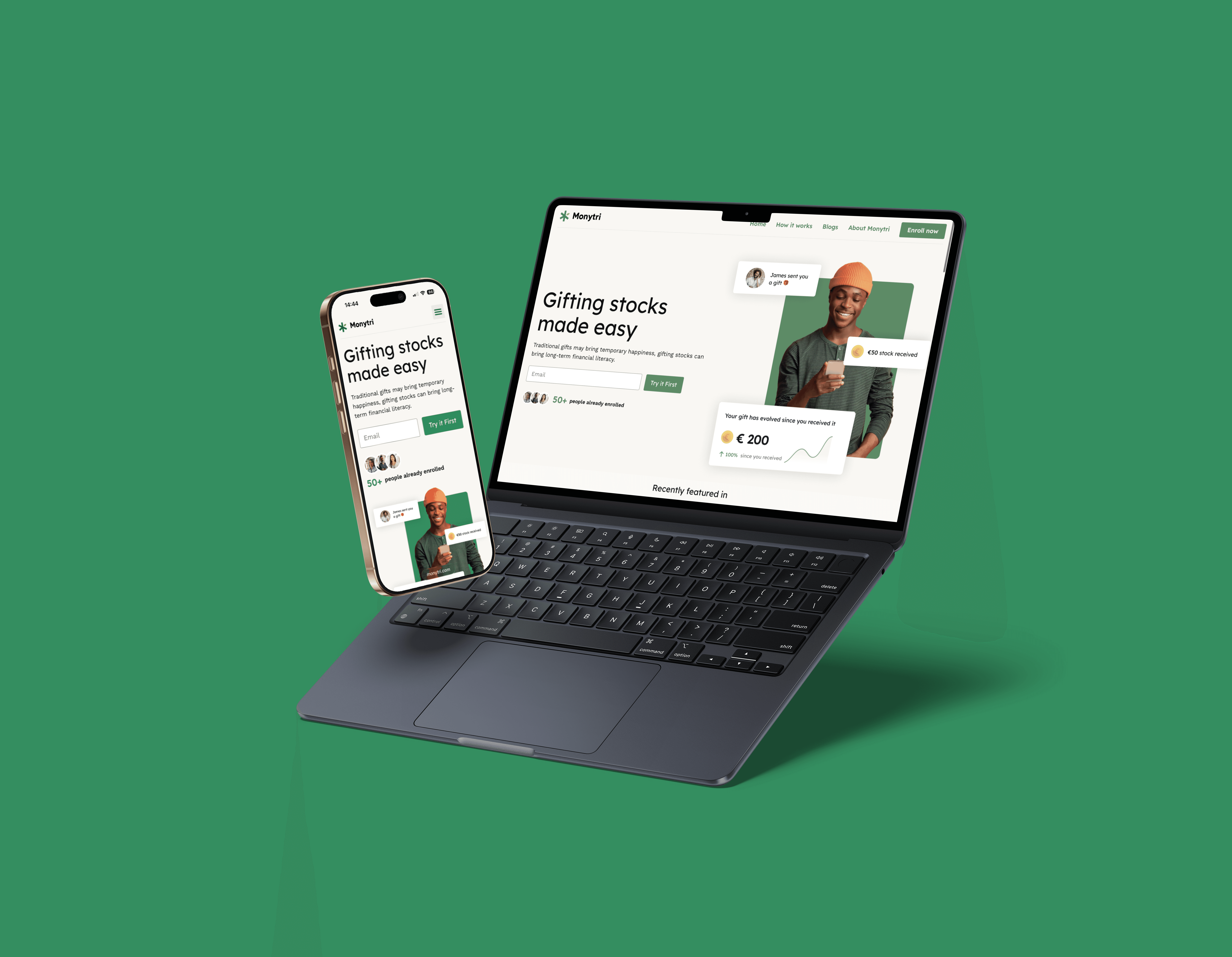
Monytri is a digital platform focused on making stock gifting easy, educational and accessible. The project started from scratch and evolved into a fully launched website with a clear brand identity and conversion-driven UX. During my internship I worked closely with the client and the design team, guiding the process from research and creative sessions to wireframes, visual design and final delivery. Monytri operates in a complex financial domain where trust and clarity are essential. The challenge was to introduce stock gifting in a way that feels approachable, educational and reliable for first-time users.
Design process
- Desk research & competitor analysis - Stakeholder interviews & creative alignment sessions - Information architecture & user flow design - Low-fidelity wireframing & validation - High-fidelity UI & visual system development - Iteration through structured feedback loops - Social & content template design


When I joined the Monytri project, the product lacked a clear strategic direction. An initial website existed, but without a cohesive structure, positioning, or user flow. The first step was not visual redesign, but defining clarity: what problem are we solving, for whom, and how should the experience support that?
During the Creative Session with the client, I helped analyse strengths and weaknesses of the existing platform from both a user and business perspective. Together we identified inconsistencies in messaging, hierarchy and navigation that reduced trust and clarity. My role focused on translating these findings into structured design principles and content guidelines that could guide future decisions.
To create alignment on direction, I contributed to moodboards and facilitated the definition of brand attributes. These adjectives became decision-making filters throughout the project, ensuring visual and interaction choices reinforced trust, accessibility and guidance. In parallel, I worked on the sitemap and information architecture, forming the structural foundation of the platform.
In the design phase, I iteratively designed key interfaces of the platform, starting with low-fidelity wireframes to validate hierarchy and content clarity before moving to high-fidelity UI. I explored multiple layout directions per section, tested navigation logic and refined content structure to reduce cognitive load. Regular feedback sessions with the design team helped sharpen interaction patterns and simplify complex information.
Beyond static design, I explored motion as a functional tool. Through self-study, I applied subtle animation to support orientation and guide attention, particularly on content-heavy pages. The goal was not decoration, but enhancing comprehension and flow.
As a final step, I designed social media templates to ensure brand consistency beyond the website and support future marketing initiatives. This extended the visual system into a scalable identity framework.
This project strengthened my ability to work within a complex financial domain where clarity, trust and stakeholder alignment are essential. The final design focuses on structured guidance and progressive disclosure, helping first-time users understand stock gifting step by step while supporting the business objective of conversion and credibility.


